A strategic rebrand that breaks with the coldness of the HR services sector.
Client:
Viapan
Expertise
- Brand building,
- Branding,
- Visual identity
Platforms
Branding
Year
2020
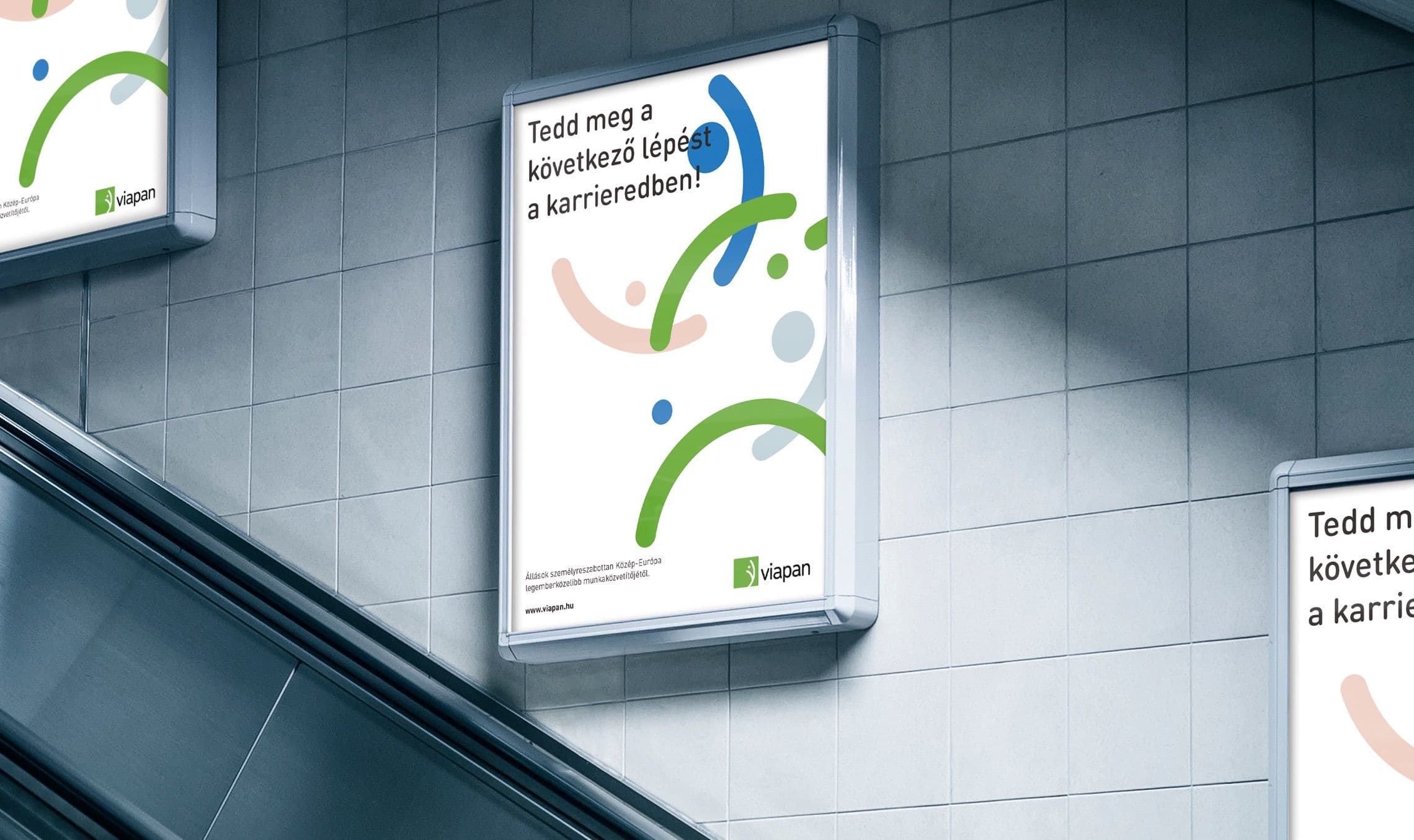
Brand building for a more human-centered labor market
Viapan Group is one of the leading HR service providers in Central and Eastern Europe, on a mission to bring people the joy of work.
For the company's new era, they asked us to create a fresh brand identity: a visual system that reflects their values and supports communication with their diverse client base.
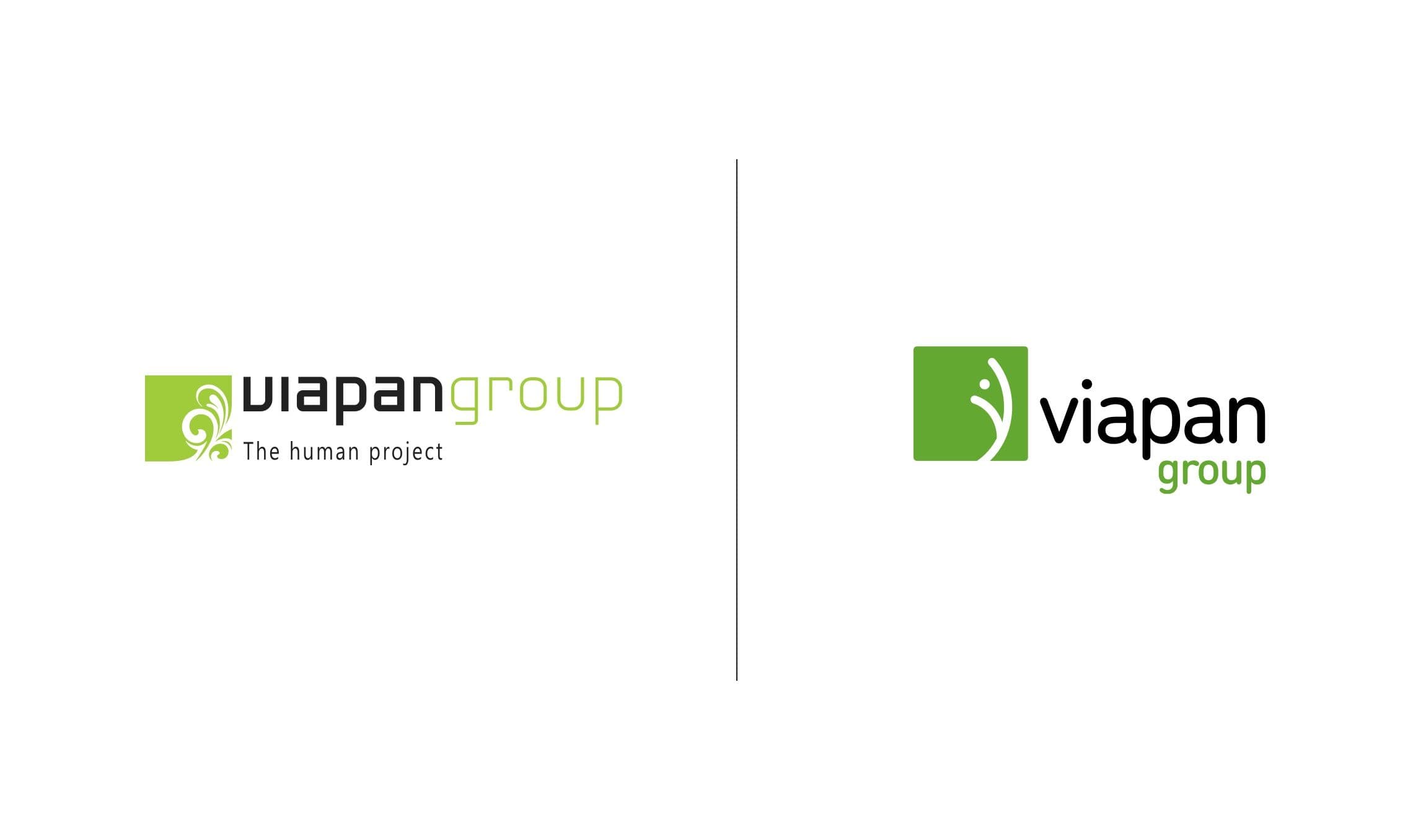
At the heart of the project were the logo redesign and a complete brand identity design. Our goal was a cleaner, more recognizable brand mark that holds its own on the international market and authentically conveys Viapan's brand values. By keeping the square shape and the green and black color combination, the new logo nods to the past while clearly showing the transformation the company has gone through over the past 30 years.
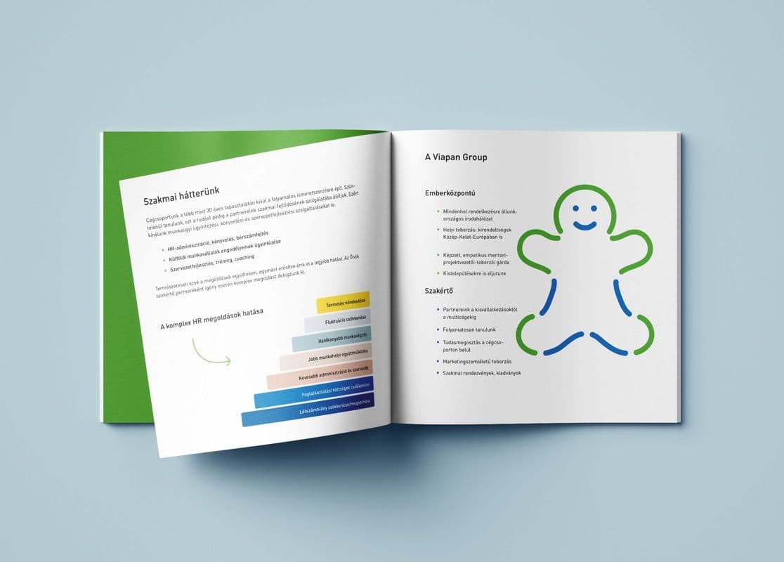
The logomark itself symbolizes what Viapan strives for: people's growth and development. The softness of the logotype comes from a friendly yet accessible typeface. The rounded terminals of the sans-serif font express the company's people-centered approach while keeping legibility flawless.
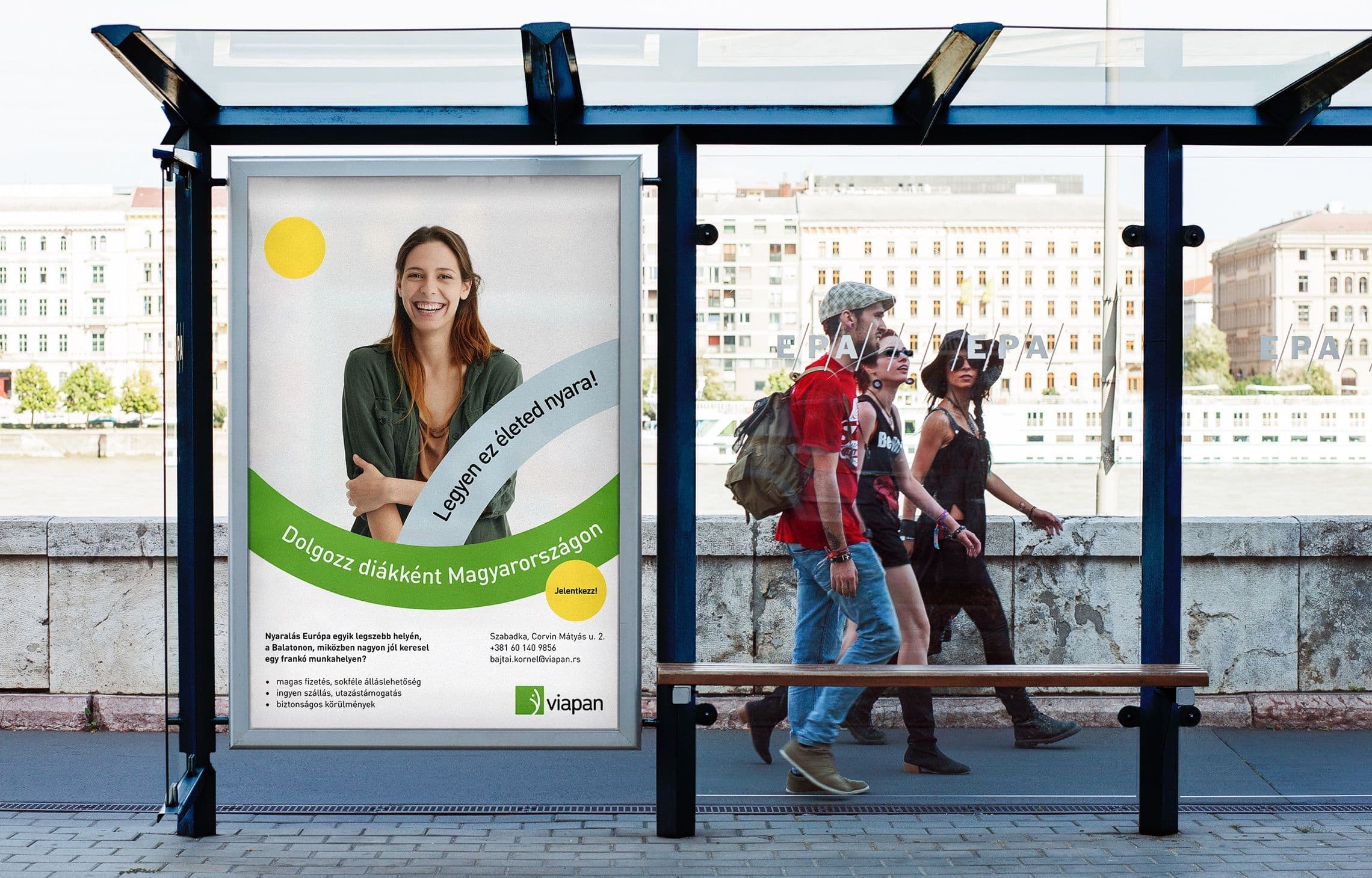
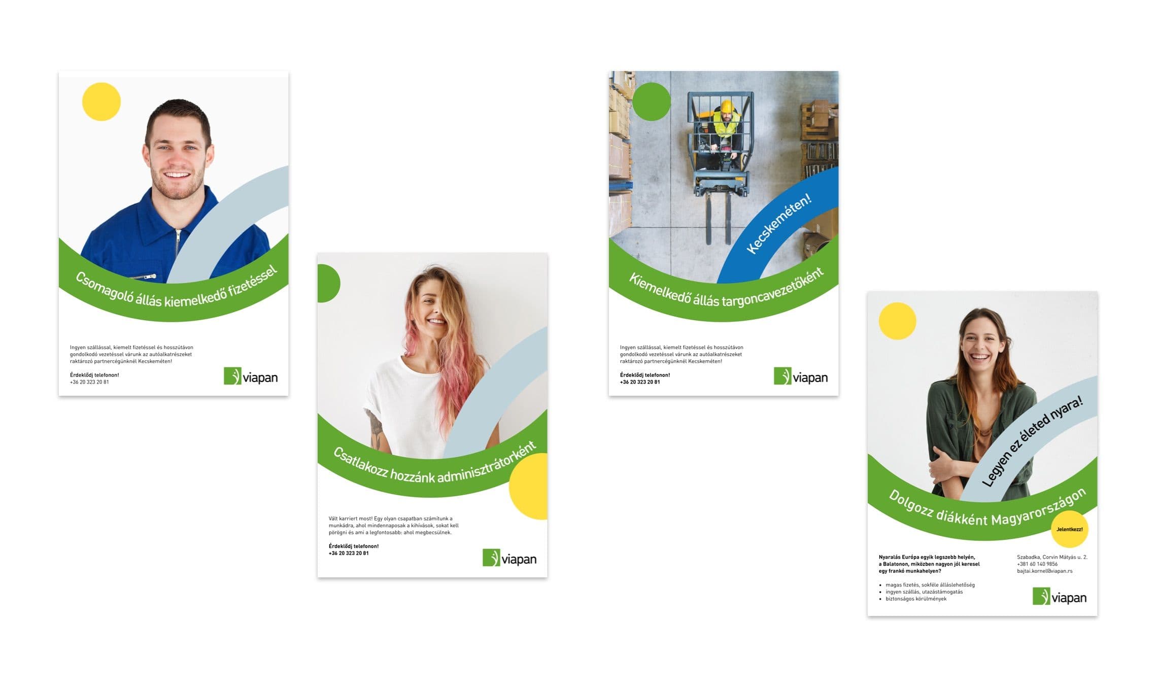
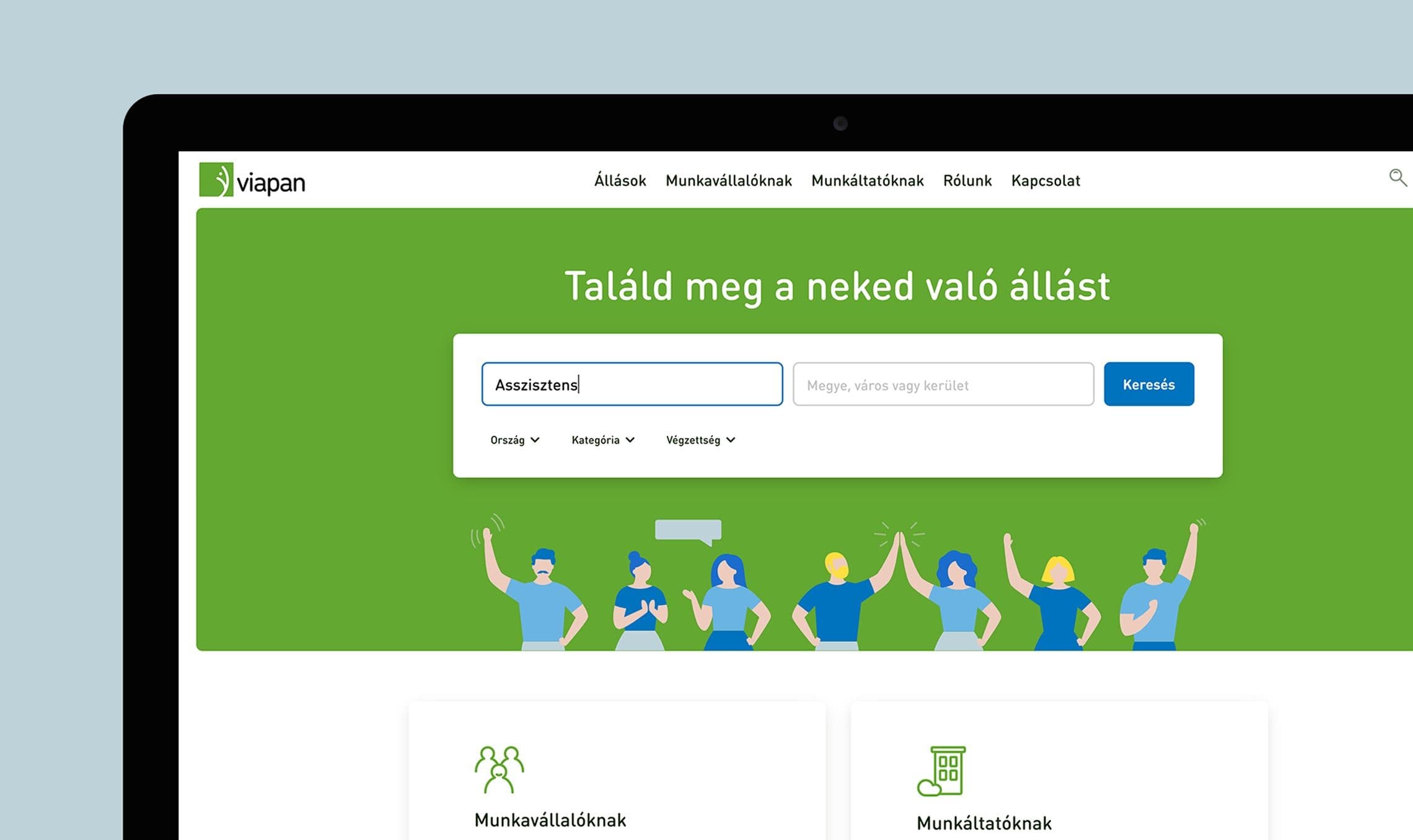
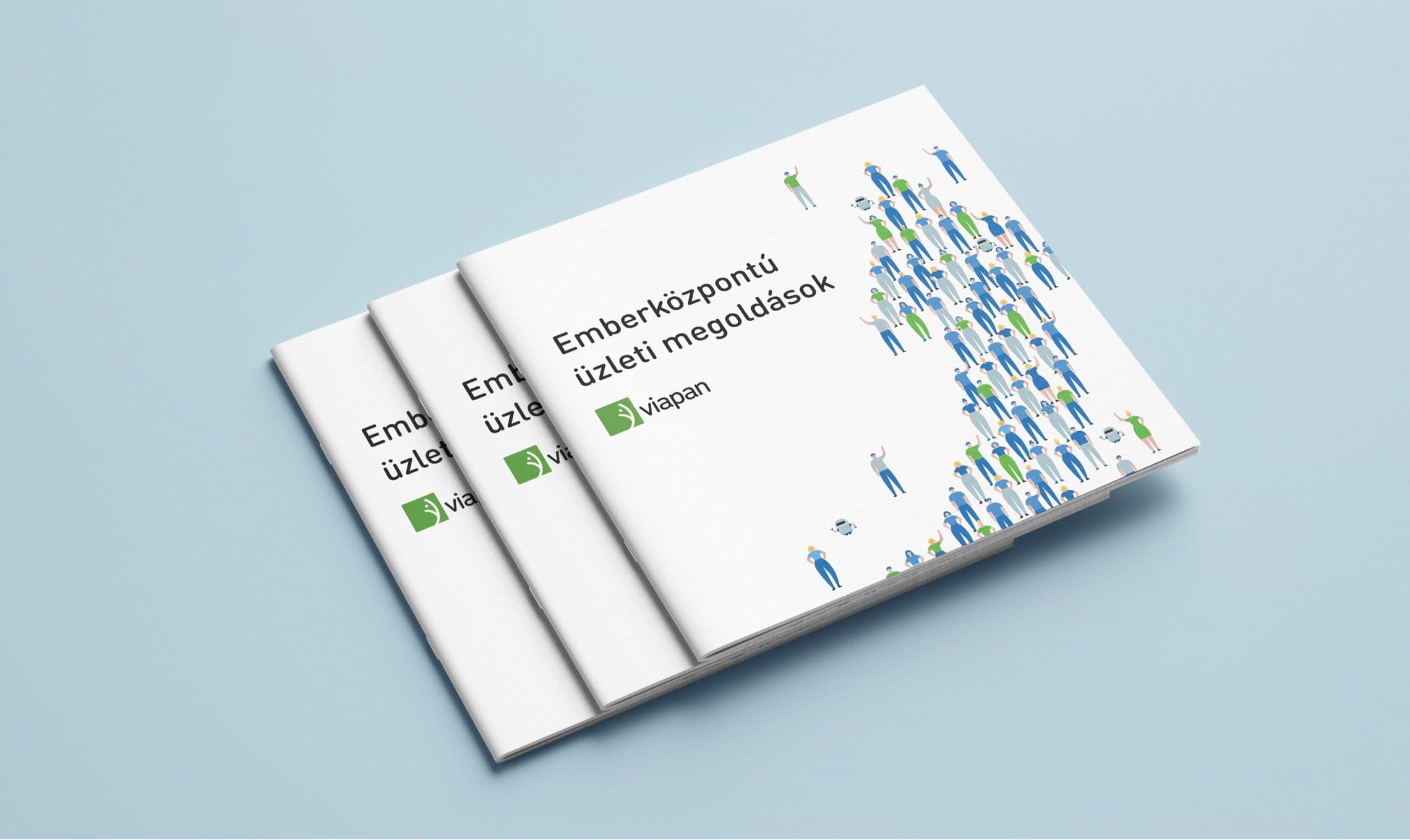
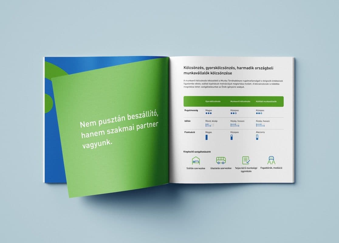
The new brand identity also gave a solid foundation to Viapan's creative campaign concepts and art direction, so the brand shows up consistently at every touchpoint, with a modern tone and an approachable character.
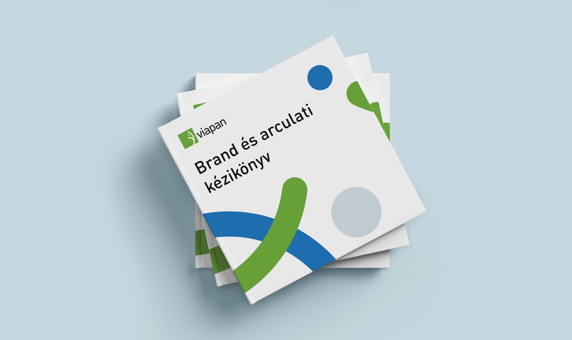
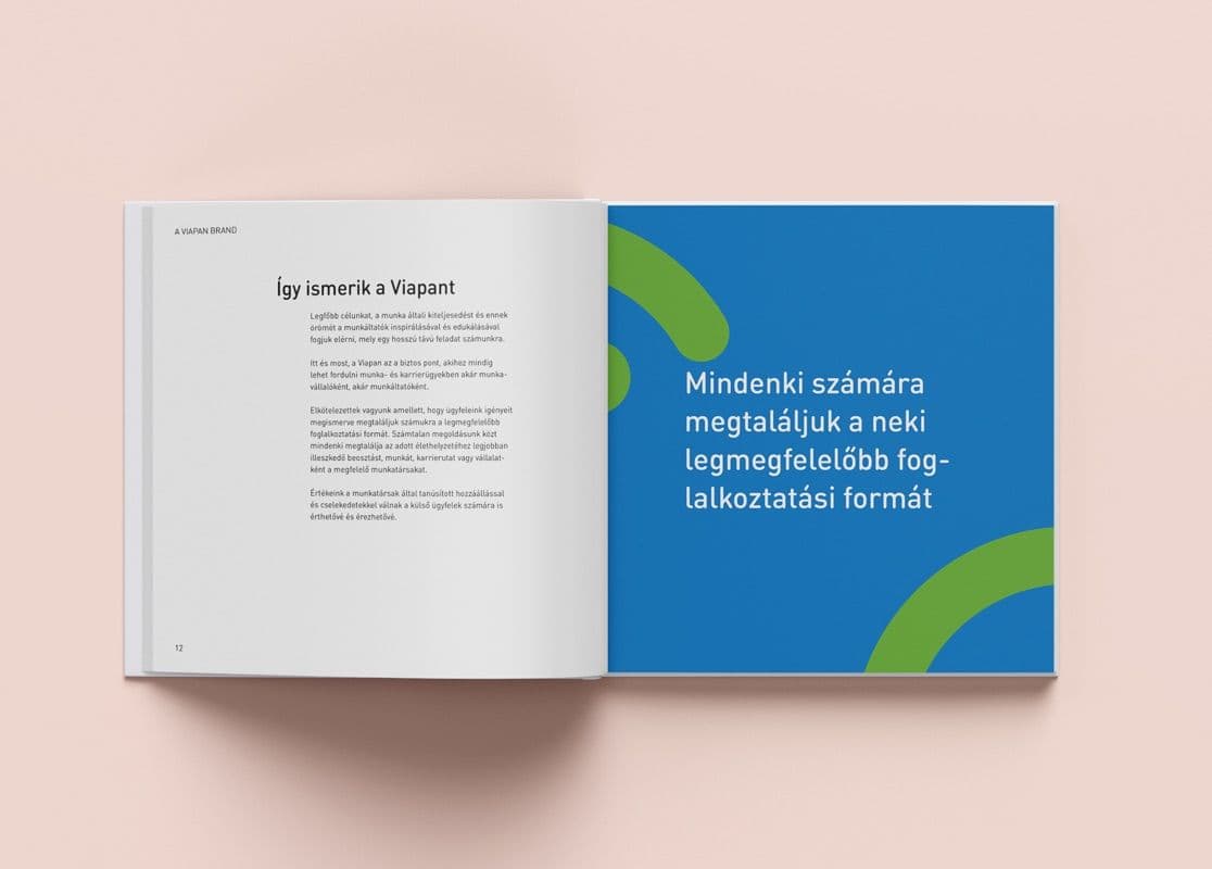
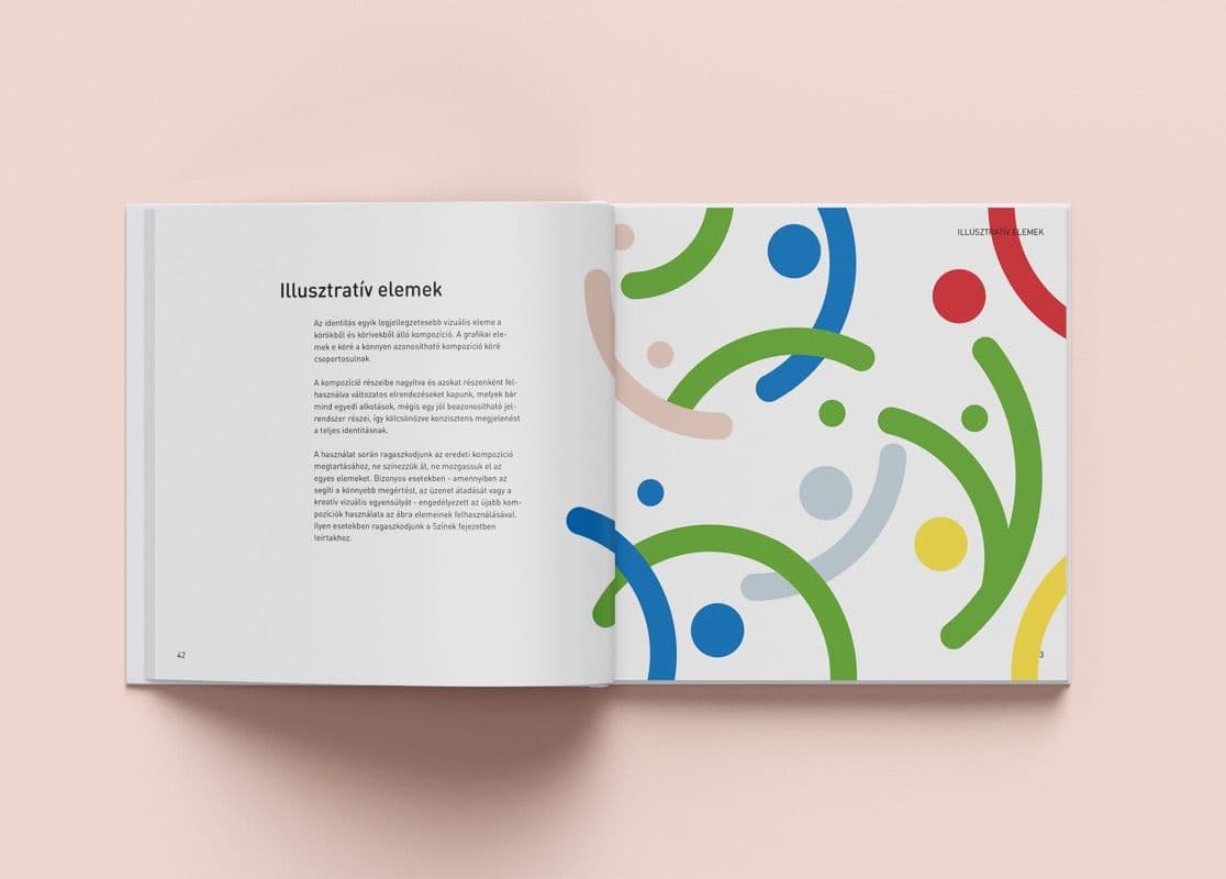
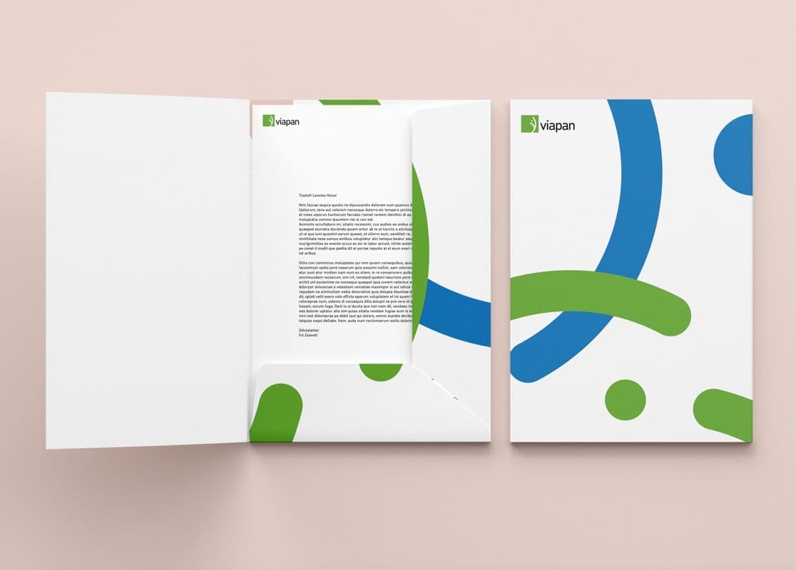
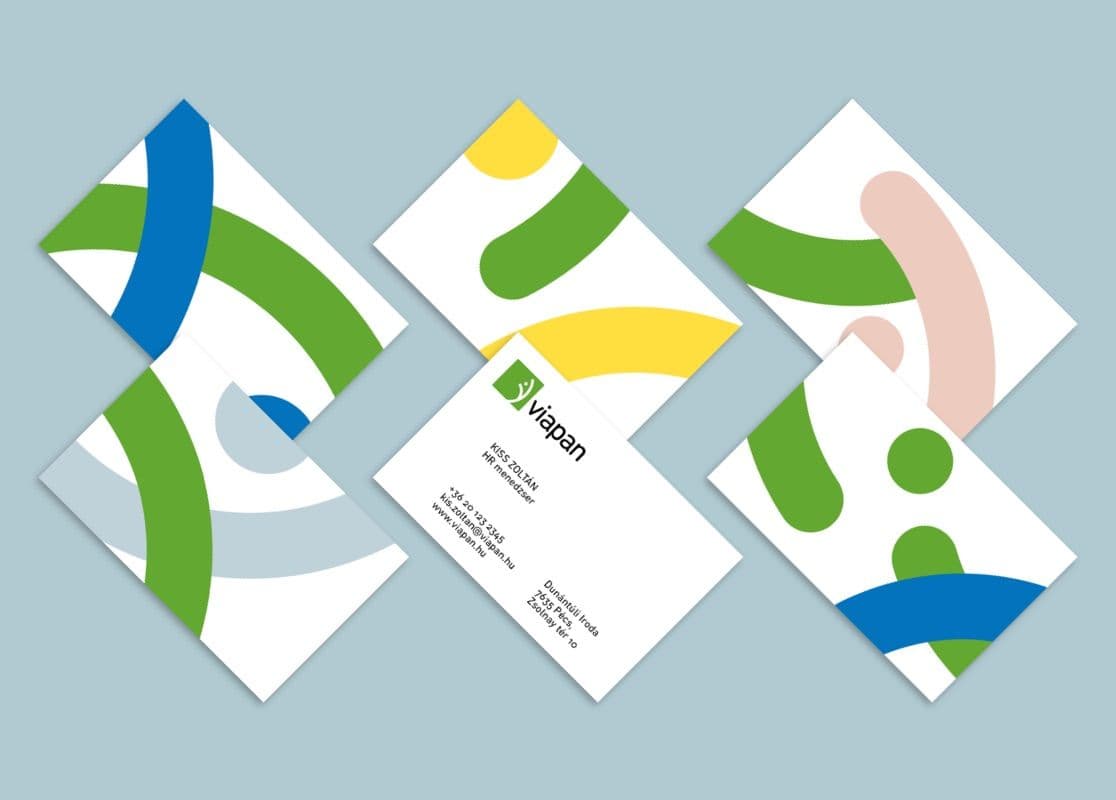
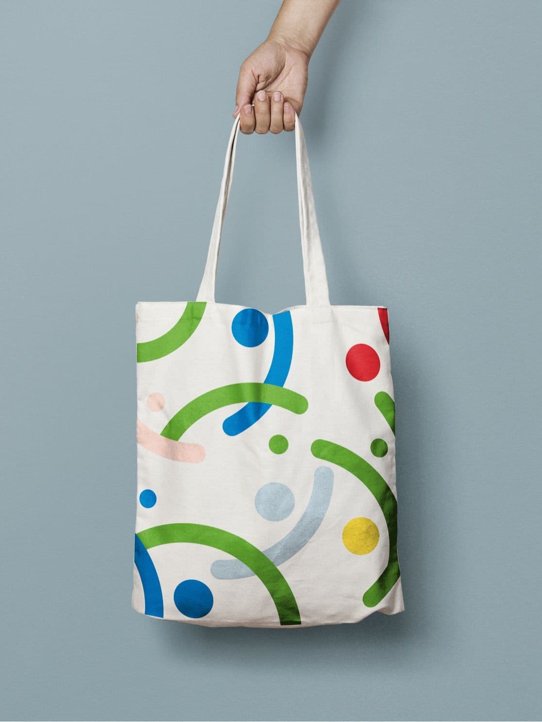
A fresh color palette and a distinctive composition of geometric shapes give the brand an instantly recognizable identity.
Built from colorful circles and semicircles, the composition extends the core idea of the logo into a complete graphic system. The playful, energetic palette reflects Viapan's diversity and deliberately eases the tension that comes with looking for a job.
By varying the elements of the composition, we created a wide range of layouts that each stand on their own as distinct visual pieces, yet clearly belong to the same recognizable system. The result is a unified visual language that adapts flexibly to all kinds of communication touchpoints and campaigns, from print to digital channels.

Do you have a project in mind?
Let's talk about how we can help bring your vision to life.
Get in touch